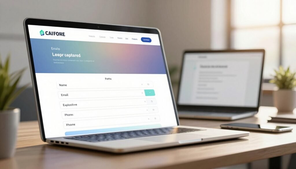
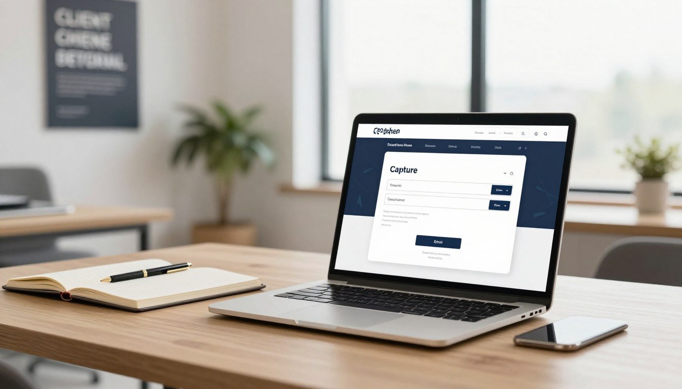
Could one short exchange—an email for a useful guide—turn curious visitors into paying customers?
We define a lead capture page as a focused landing asset where a visitor trades contact information for clear value. Its single goal is conversion through a simple form and a compelling offer like an ebook, demo, or trial.
For U.S. service businesses, this kind of landing page moves beyond clicks and focuses on appointments, consultations, and revenue. Email still performs well, returning about $36 per $1 spent, so the captured email becomes a valuable asset for nurture and segmentation.
In this article we’ll explain how headline, offer, form, and CTA work together, why fewer distractions help, and how X3 Agency builds these assets to cut acquisition costs and increase conversion rates for law firms, clinics, and other professionals. Call us at +1 (645) 201-2398 to get help faster.
Why Lead Capture Pages Matter for Service Businesses in the United States
When service businesses need steady inquiries, a focused landing experience does the heavy lifting.
Leads are the lifeblood of any business, yet only about 27% are qualified. We help U.S. service providers—from law firms and home services to healthcare and AEC—turn ad spend and organic visibility into qualified leads and real customers.
A dedicated capture landing filters interest early and routes inquiries to the right team. That saves sales time and reduces wasted follow-ups. It also improves closing rates by prioritizing high-intent prospects.
Localized landing pages speak to people searching for nearby solutions, which boosts relevance on Google and Meta. We align page goals with pipeline metrics—appointments, consultations, estimates—so marketing moves the needle on sales.
Design for mobile-first conversion, respect compliance in regulated sectors, and layer retargeting for visitors who don’t convert at first. We benchmark lead quality continuously so marketing and sales agree on what defines a qualified inquiry.
Lead Capture Page: Definition, Purpose, and How It Differs from Other Landing Pages
Pages that host a short form and a clear reward exist to turn intent into scheduled conversations. We build these focused assets to trade a useful deliverable—guide, webinar, or demo—for contact information. That single exchange drives booked opportunities, not just clicks.
Unlike a click-through landing that sends visitors onward to checkout, this style of landing hosts the form itself. Fewer links, a strong visual hierarchy, and one dominant form area keep attention on completion.
Offer choice matters by funnel stage: checklists and guides for early interest, webinars and demos for mid-funnel, and consultation requests for bottom-funnel prospects. Form fields should match the reward—short for low-value assets, more detailed for a booked consult.
We always state the next step after submission—instant download, calendar invite, or a committed follow-up window. For law, clinics, and home services, compliance and urgency shape copy and required information. Success is measured in booked conversations and revenue, not just form fills.
Search Intent at the present: What Visitors Expect When They Land on a Lead Capture Page
People arrive looking for speed, clarity, and a simple next step. We map common intents—compare providers, check pricing, or request a consultation—to set the right headline and offer.
A clear headline that mirrors ad copy keeps a visitor from hitting back. Message match improves trust and protects ad quality scores. Fast load and mobile usability matter; many visitors decide in seconds.
Specificity boosts relevance: “Same‑day AC repair in Phoenix” tells people the value immediately. A tight subheadline and concise bullets help scanning and guide quick action.
We suggest trust signals above the fold for medical and legal work to lower anxiety. Show a clear next step—instant booking, download, or a callback window—so visitors know what happens after they submit.
Match content depth to intent: brief copy for urgent services, fuller detail for high-consideration searches. Use team photos or before/after visuals to reinforce credibility without slowing the landing.
The X3 Agency Approach: Real Clients over Clicks
We build landing experiences that turn marketing spend into booked consultations and long-term customers.
Our process starts with research and ends with continuous optimization. We combine Google Ads, Meta Ads, SEO, and social to attract relevant traffic. Then we match messaging to the offer so visits become qualified inquiries for your business.
We use conversion-centered design: one offer, clear CTA, and a simple form. Testing shows multiple offers can drop conversions by up to 266%, so we keep focus tight. That cuts customer acquisition cost and raises sustainable revenue.
We score and qualify each inquiry so your sales team talks to the best prospects. We test short vs. multi-step forms to balance quantity with quality and refine campaigns that boost show rates and close rates.
Want a tailored plan and benchmarks for consultation, show, and close rates? Call us at +1 (645) 201-2398 or see our landing pages to learn how we turn traffic into customers.
Know Your Goal and Audience Before You Build
Before any design work, decide who you want to reach and what success will look like.
We tailor each capture landing to a defined audience segment—new leads, nurtured prospects, or existing customers. That focus helps us match the offer to visitor interest and set realistic targets like 12% conversion or 50 leads per month.
Next, we list what information the sales team needs and limit form fields to those essentials. Asking only what you will use preserves conversions while giving your team the context to qualify potential customers.
We break the funnel into clear steps: click to form, form start, and form completion. Tracking those events isolates bottlenecks and improves generation of qualified leads.

Before launch we align analytics—UTMs, source/medium, and event tracking—and set numeric KPIs for conversion rate, lead volume, and cost per lead. We also map post-submit steps: instant scheduling, onboarding resources, or follow-up windows to keep momentum high.
Finally, we document a testing roadmap that covers audience, creative, offer, and form experiments so pages learn and improve over time.
Craft a Compelling Value Proposition and Reward
Visitors decide in seconds; your value proposition must make the benefit crystal clear.
We state outcomes in plain English: what someone gets, how it helps, and the next step. Short subcopy and skimmable bullets sell the value fast. Examples like a city-specific checklist or a social reporting template show practical use instantly.
Choose the right reward for funnel stage—consultations or demos for bottom-funnel prospects, checklists or whitepapers for early interest. Morning Brew’s email-first flow shows how simple opt-ins boost signups, then collect details later.
Perceived value sets how much information you can ask for. Higher-value content (webinars, free trials) justifies longer forms. Lower-value offers need minimal fields to keep conversions high.
Deliver content by email for instant gratification and follow with a confirmation page that sets expectations. Tie the reward to our sales process so booking a consult is the natural next step. Use limited-time dates for webinars to add urgency without pressure.
Headline and Message Match That Keep Visitors on the Page
Matching the ad message on arrival tells people they landed in the right place and reduces friction. We write headlines that mirror the promise in your ads so visitors feel confirmed instantly.
Use a simple formula: pain or outcome + specificity + clarity. For example: “Same‑Day HVAC Repair in Phoenix — Book in 30 Minutes” or “Free Intake Consult for Estate Planning — 15‑Minute Call.”
Pair that main headline with a short subheadline that clarifies the value. The subheadline should state the reward and next step in plain language so people decide fast.
Place the primary cta button near the headline and repeat the action further down the page. Add microcopy beside the button to lower anxiety: “No obligation” or “Confirm a time.”
Keep brand elements consistent from ad to landing. Tone, colors, and type that match your ads help both people and ad platforms register message match and can lower CPCs.
Social Proof That Builds Trust and Credibility
Real-world testimonials and clear metrics turn hesitation into action for skeptical visitors.
We layer social proof across the page so trust appears where decisions happen. Short quotes with full names and specific outcomes feel believable. A summary stat—like “5,000 patients served” or “1,200+ five-star reviews”—gives quick context for customers.
We prioritize which proof fits your brand and niche. For regulated fields we place certifications, partner logos, and privacy notes near the form to reduce friction. For high-volume offers, registrant counts and years in business (think 80,000 students, 14 years) work well as credibility examples.
Practical steps we use: surface reviews, show media mentions, add an anti-spam note by the email field, and include a short preview of any gated asset. After conversion, we suggest a shareable thank-you that drives referrals and amplifies proof across other landing pages.
Conversion-Centered Design Principles for Capture Landing Pages
Design that guides the eye and limits choices makes the intended action obvious fast.
We define a clear visual hierarchy: hero headline, concise benefits, proof, and a prominent form or booking module. This layout focuses visitors and raises conversion without extra options that dilute intent.
We keep sections scannable with short subheads, white space, and bold lines that point users toward the main action. Consistent visuals from ad to confirmation keep momentum and reduce drop-off.
Accessibility and speed matter. We use legible fonts, strong contrast, and optimized images so the experience works on all devices. Microcopy near the form answers privacy and response-time questions to ease anxiety.
On mobile, we place the primary button where thumbs reach easily and remove top navigation that creates exits. For examples of our work and full service details, see our company website.
Optimizing Form Fields for Qualified Leads
Smart forms balance speed with the right questions to qualify prospects effectively.
We choose the number of form fields based on the offer’s value and your qualification needs. For top-of-funnel offers we keep it minimal—often email only—then collect extra information later via progressive profiling.
Multi-step forms work well for higher-intent visitors. HubSpot data shows multi-step forms can convert up to 86% higher. Start with easy questions and save sensitive or complex items for the last step.
Place the form above the fold and repeat it in longer layouts. Use autofill, dropdowns, and radio buttons to cut completion time and reduce errors. Ask the most intimidating questions last so people finish the easy parts first.
We also optimize button copy to set expectations—examples include “Get Your Estimate” or “Book Your Consultation.” Add a brief privacy note like “We’ll never spam you” and connect forms to instant scheduling when appropriate.

Finally, we test short vs. longer forms to find the sweet spot between volume and lead quality, and build thank-you flows that tell customers exactly what happens next.
Traffic Sources and Targeting: Driving the Right Visitors
Not all visitors are equal; effective targeting brings people who want your service to the front of the line.
We combine Google Ads, Meta Ads, SEO, social media, and email to send timely traffic to your capture landing experiences across the United States.
For cold PPC and social traffic we promote educational rewards like webinars and guides. Those offers help with lead generation and set expectations before we ask for more information.
Organic SEO and content hubs move readers to tightly matched landing pages via internal links. That improves relevance and helps conversion when visitors arrive.
We build Meta audiences by interests, behaviors, and lookalikes, and use Google search terms to align headlines for better Quality Scores. Retargeting sequences raise offer strength over time for visitors who don’t convert initially.
Segmented email campaigns deliver high ROI and can drive warm traffic to personalized capture landing experiences. We coordinate UTMs and platform pixels so attribution is accurate and costs per lead guide budget decisions.
Lead Capture Page Copy and CTAs That Convert
Clear, outcome-driven copy and a single obvious action turn casual visitors into booked consultations quickly.
We lead with the benefit in the headline, then follow with two short lines that explain the value. Our content answers “what happens next” so visitors click with confidence.
Use one dominant button and match its label to the promise. Labels like “Book Your Consultation,” “Get Your Estimate,” or “Download the Guide” set expectations and reduce friction.
Place the primary CTA above the fold, repeat it midway, and add a final button near the form so intent converts at every stage.
Microcopy beside the button clarifies timeframe, cost, and follow-up—simple facts that lower anxiety and increase form starts. We keep form fields tight and let the button confirm the exact action promised in the headline.
We test copy, button labels, and placement to find the highest-quality clicks. Small wording changes often raise qualified inquiry rates more than layout changes.
Lead Capture Page Examples and What We Can Learn
Real-world examples show how specific offers, visuals, and form flows move prospects to action.
We start with Intercom and Samsara: both use form simplicity and multi-step flows to reduce friction. Intercom keeps the initial ask tiny. Samsara keys progress so the email comes later.
Oscar visualizes benefits like a membership card. That tangible proof works for service reports and sample results in local niches.
Some CTAs fail—HelloSign’s “Contact Us” is vague. We rewrite similar prompts to be outcome-driven, e.g., “Get your free consult.”
ADP and KlientBoost show progress bars and segmented flows that personalize conversion paths. Zendesk’s interactive demo and Wise’s fee calculator demonstrate how tools can pre-qualify and increase trust.
Pipe and WordStream sell the next step with clear value exchanges and graders. Slack’s dual-purpose form teaches us to route support and sales without losing prospects.
Quick checklist: keep forms short, add visual proof, use clear CTAs, test multi-step flows, and consider small calculators or graders for local service offers.
Testing and Iteration: From A/B Tests to Post-Conversion Experience
A methodical test plan turns guesses about copy and forms into repeatable conversion wins.
We set hypothesis-driven A/B tests across headline, value proposition, imagery, and CTA copy. Then we run short vs. multi-step experiments, vary field order, and watch how form starts change over time.
Multi-step flows can lift conversion by as much as 86%, while an aggressive field cut once caused a 14% drop. We keep the primary form above the fold and use progress indicators when steps help reduce perceived friction.
We measure more than the initial conversion rate. Lead quality, downstream sales metrics, time to contact, and show rates guide our decisions. We also test message match between ads and the landing experience to protect pre-click consistency.
To compound learning, we set significance thresholds, keep a change log and calendar, and loop CRM feedback into new tests. Over successive steps, small design and copy wins add up to more qualified leads and better sales outcomes.
Conclusion
A tight conversion asset marries a clear promise with one simple action, a prominent CTA, and a minimal button to drive results fast while showing value.
We stress strong headlines, concise proof, and short forms so people finish the form and book appointments. Align offers to intent and test multi-step flows to lift quality over time.
Measure beyond submissions: track appointments kept, show rates, and deals won to judge real generation. Build a library of audits, calculators, and guides and follow up fast with email confirmations and clear next steps.
Small improvements to a capture landing compound into lower acquisition cost and higher ROI. We work with U.S. service businesses to design and optimize these assets—call X3 Agency at +1 (645) 201-2398 to map your next win.


